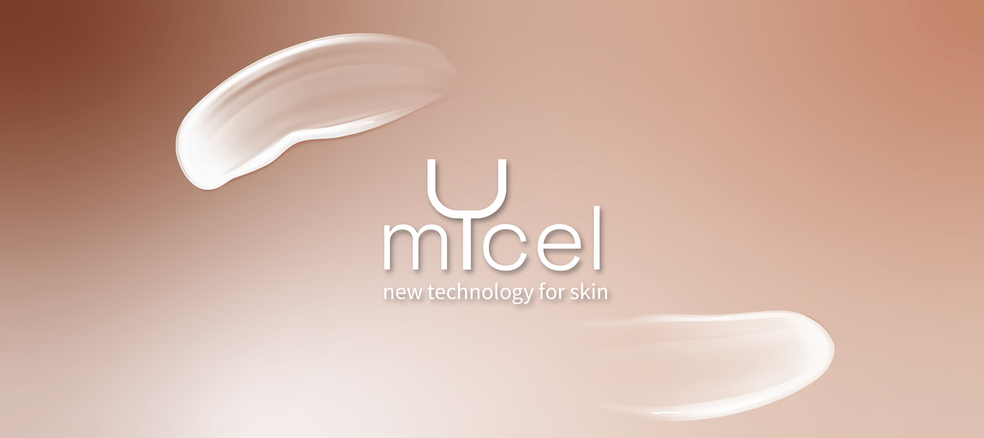
Mycel is a skincare project born from the concept of "Biomimetic Elegance." The identity focuses on the mycelium nature’s invisible, intelligent network reimagining it as a sophisticated "new technology for skin." The visual language I developed balances clinical efficacy with Earth’s deep rooted wisdom, moving away from sterile pharmaceutical aesthetics toward a tactile, premium sensory experience.
I built the creative direction on a dual track: on one side, clinical laboratory precision; on the other, the raw, ancestral beauty of the fungal kingdom. The logo, with its fine lines and stylized "U" that evokes both a culture dish and a mushroom cap, serves as a seal of scientific purity set against a backdrop pulsing with organic life.
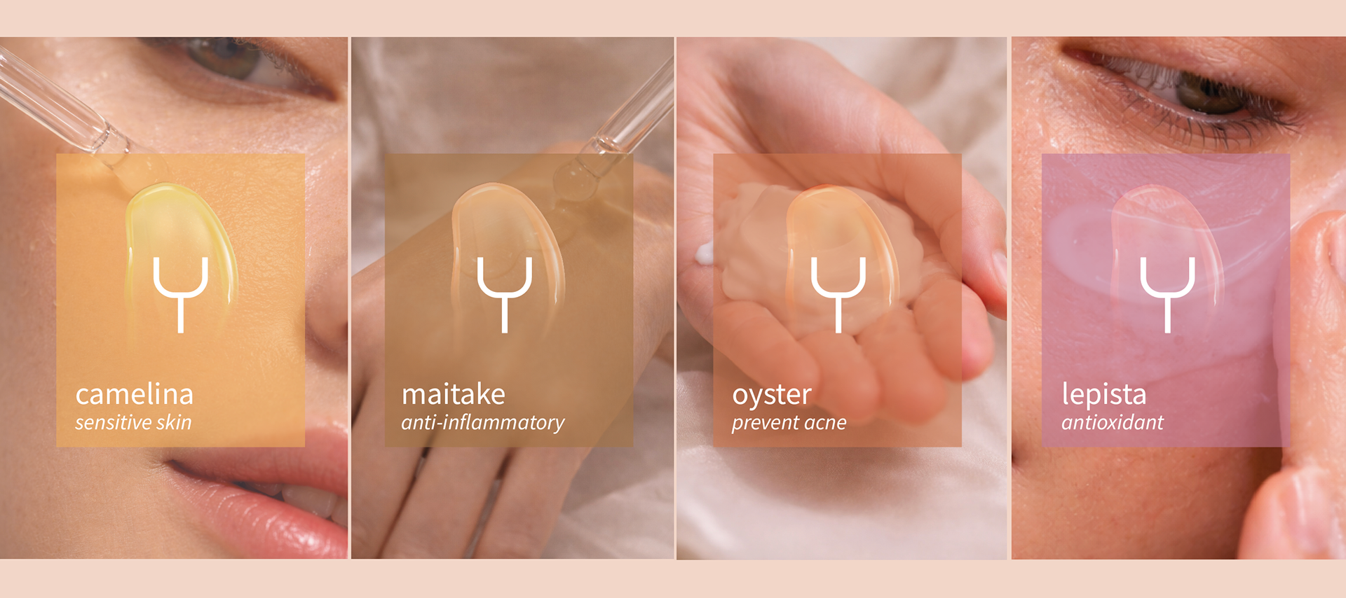
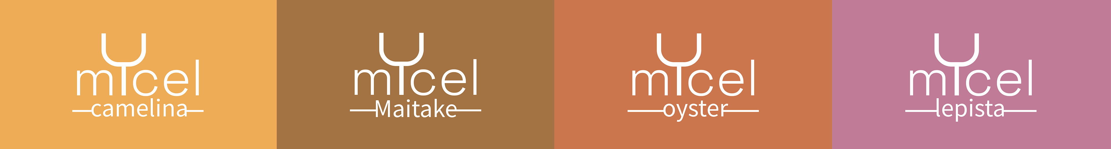
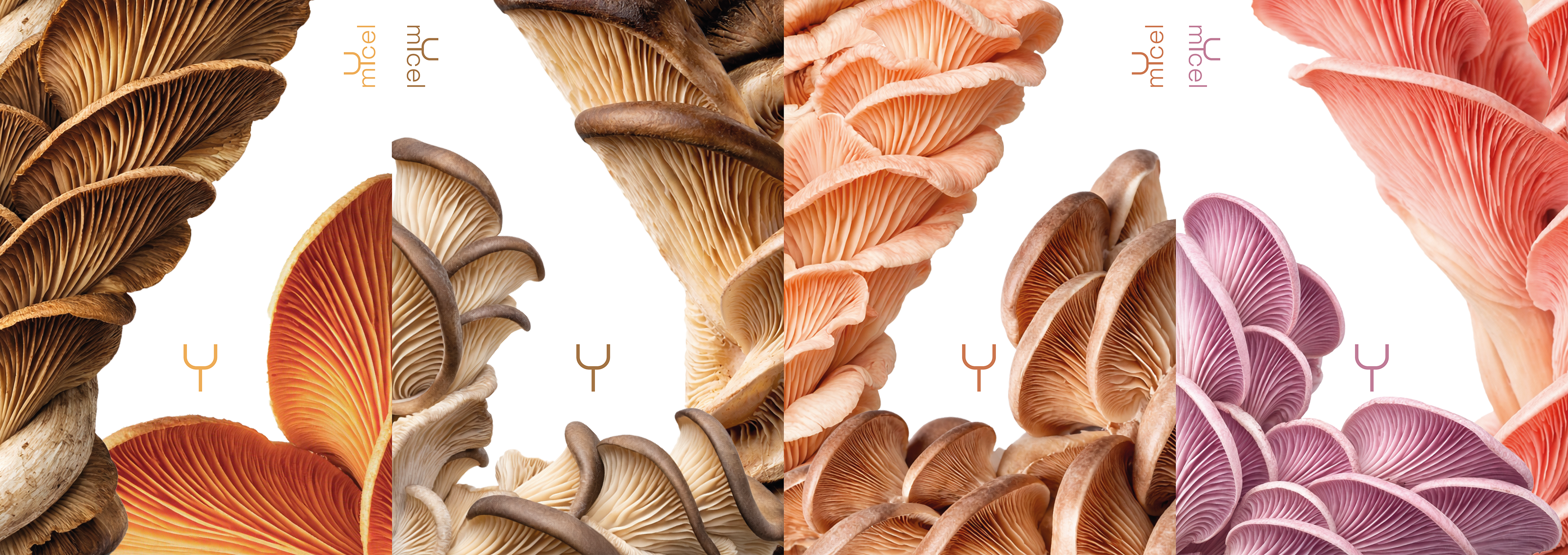
The visual narrative unfolds through a functional color system designed to make each product’s benefit instantly intuitive. I didn't just choose simple colors, but rather botanical "atmospheres": the warm amber of Camelina for protection, the earthy tones of Maitake for resilience, the vibrant orange of Oyster for purification, and the sophisticated plum of Lepista for antioxidant regeneration.
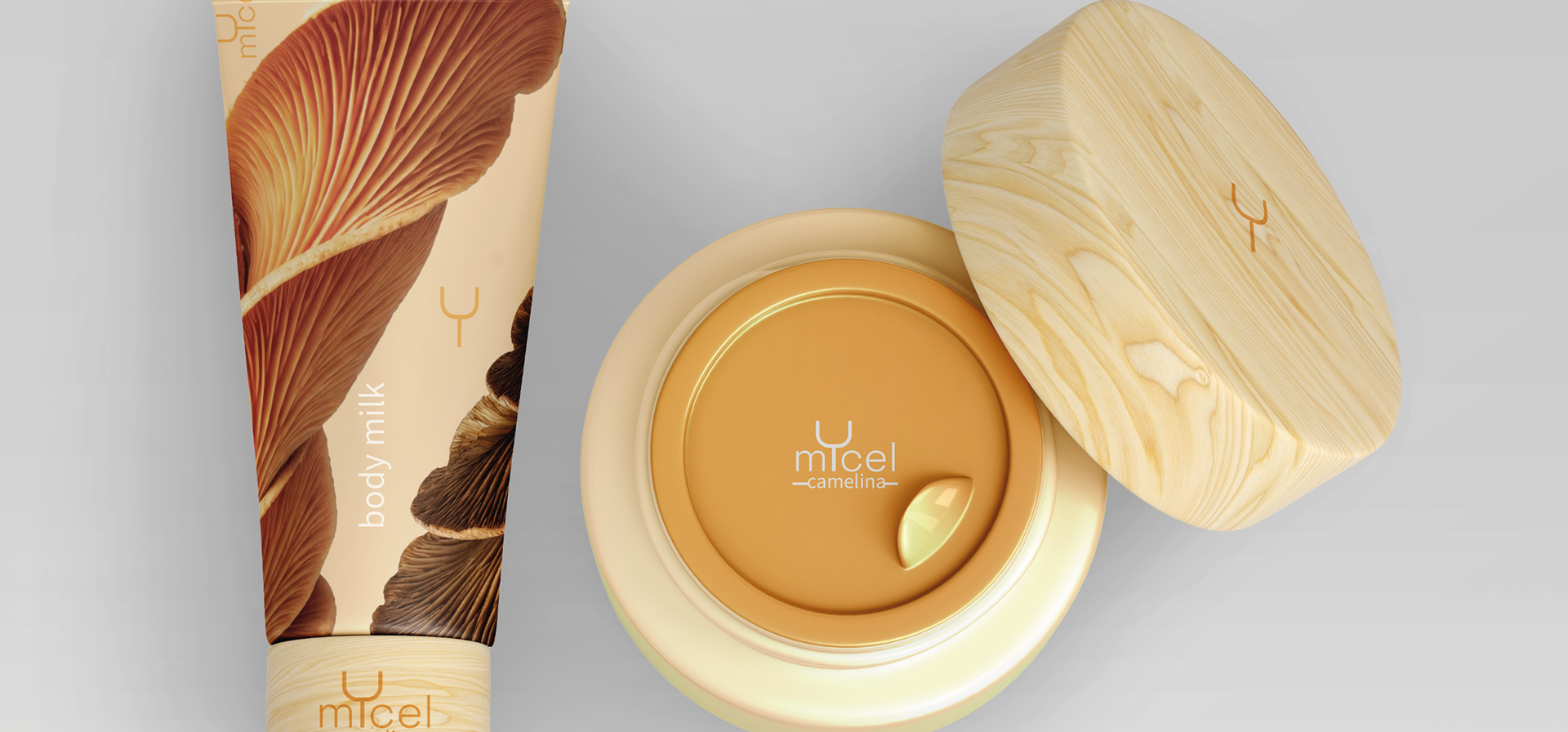
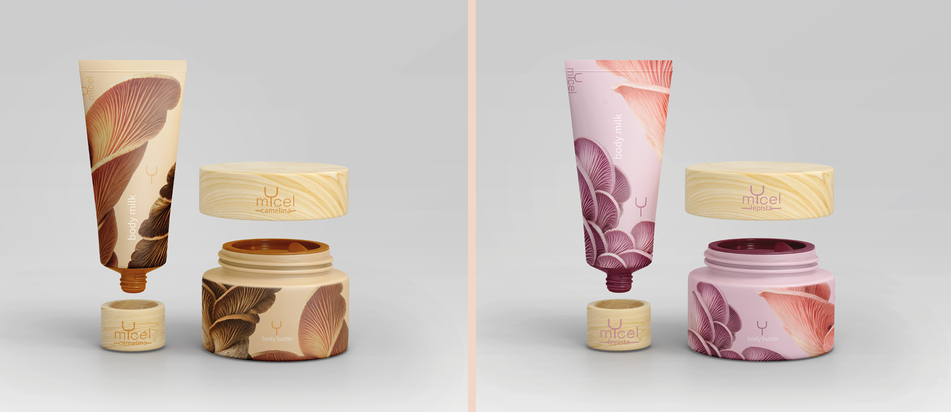
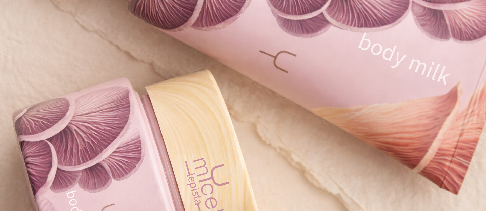
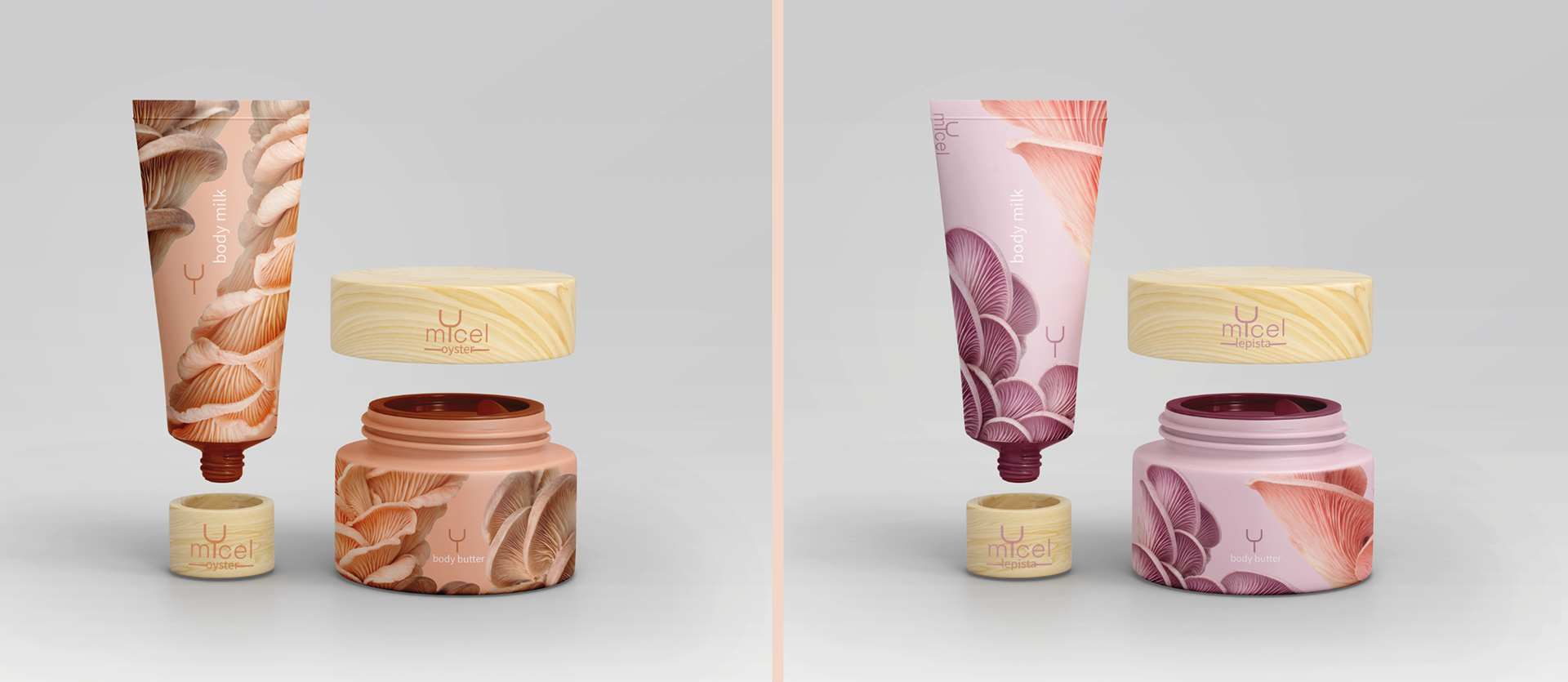

In the packaging, I wanted the contrast to be tactile. This is why I paired hyper-realistic macro illustrations of mushroom gills and textures with the physical materiality of the natural wood caps. Each bottle and tube is more than just a container; it is a piece of design that celebrates biodiversity through a macroscopic lens.